
Drop
Dates
September to December 2014
Built With
Kyle Dillon, Corey Short, Imran Yousuf, Ruchita Rathi
Mission
To bring urban travelers and city “experts” together by redefining the art of discovery.
My Role
UX Researcher, UI Designer
Tagline
Every memory has its place.
Technologies
Adobe Illustrator, FramerJS, Android SDK, Camera API, Qualcomm Toq API, Google Maps API
Jump down to the video demo of the finished app.
Background
We set out to bring urban travelers and local city experts together. As an example, you’re all the “experts” in Berkeley, and urban travelers visiting the city or campus for the first time want to find out about real Berkeley life, but how do they get to us as experts? Drop makes it possible. There are tons of recommendation apps and travel guides out there, but they overload the traveler with information. Go on Yelp and search for food — you’ll see pages of 4 and 5 star restaurants with dozens of pictures each, and it takes ages to make a decision. Or, look on these guides and get stuck in a tourist trap instead of the hidden gem that only local experts know about.
With Drop, we’ve also redefined the art of discovery. When we connect travelers with experts, the travelers can feel a sense of both spontaneity and ownership in what they find: the local, hidden gems.
Competitive Analysis
In other apps we researched during our competitive analysis phase, such as Yik Yak, Shotnote, and Drop A Memo, we saw that the key element of discovery was missing.

Drop, paired with the Toq watch, changes that. It allows users to actively search out drops or passively and spontaneously stumble across amazing finds. We also saw a lack of versatile media and sharing settings, so we focused on those areas as well. In everyday use, the phone app is geared more for “expert” sharing, and the watch app toward traveling and discovering.
User Studies
We observed two spectrums of the target users — expert native stranger and novice urban traveler. Target users were observed within their regular environments and were charged with tasks like finding a great bar to have a drink and some food. We extensively applied the master-apprenticeship model throughout the user study. We also observed each urban traveler’s interaction with his or her digital self and tour guides to understand various touchpoints of the discovery process.
We periodically queried the user about his or her decisions, choices, and problems that came from determining the essential tools, services, and functionality required in order to complete the given task. We also made sure that the user explained the prime motivations behind his or her actions during the search process.
Through observation techniques, we aimed to understand the sequence of various events and assumptions. In our case, we observed that end-users (urban travelers) assumed that the native stranger was master of information by default.
Findings
- Users want to be in vacation auto-pilot mode.
- Users need visibility of social activities and information in local environment.
- Users are overloaded with information during their search process.
Design Process
Iterating made a huge difference, both with functionality and aesthetics.
 First major iteration of Drop
Drop’s phone app started out looking more like an app for navigation than one for social and sharing. It also lacked a modern design aesthetic.
 Second major iteration of Drop
In our first redesign, we focused on the latter, and upgraded to material design. But we still found Drop’s phone UI clunky to navigate, with too many screens and steps to get to the key feature of the phone — sharing.
 Third major iteration of Drop
In our second major redesign, we pivoted on the functionality, opting to focus on visual media rather than text, thereby simplifying the app immensely. We also used a mode switch to help people distinguish between sharing with friends and sharing with the public, instead of complicated picking and choosing. And, we updated our privacy settings to use usernames and pictures, rather than anonymity for more accountability in public drops.
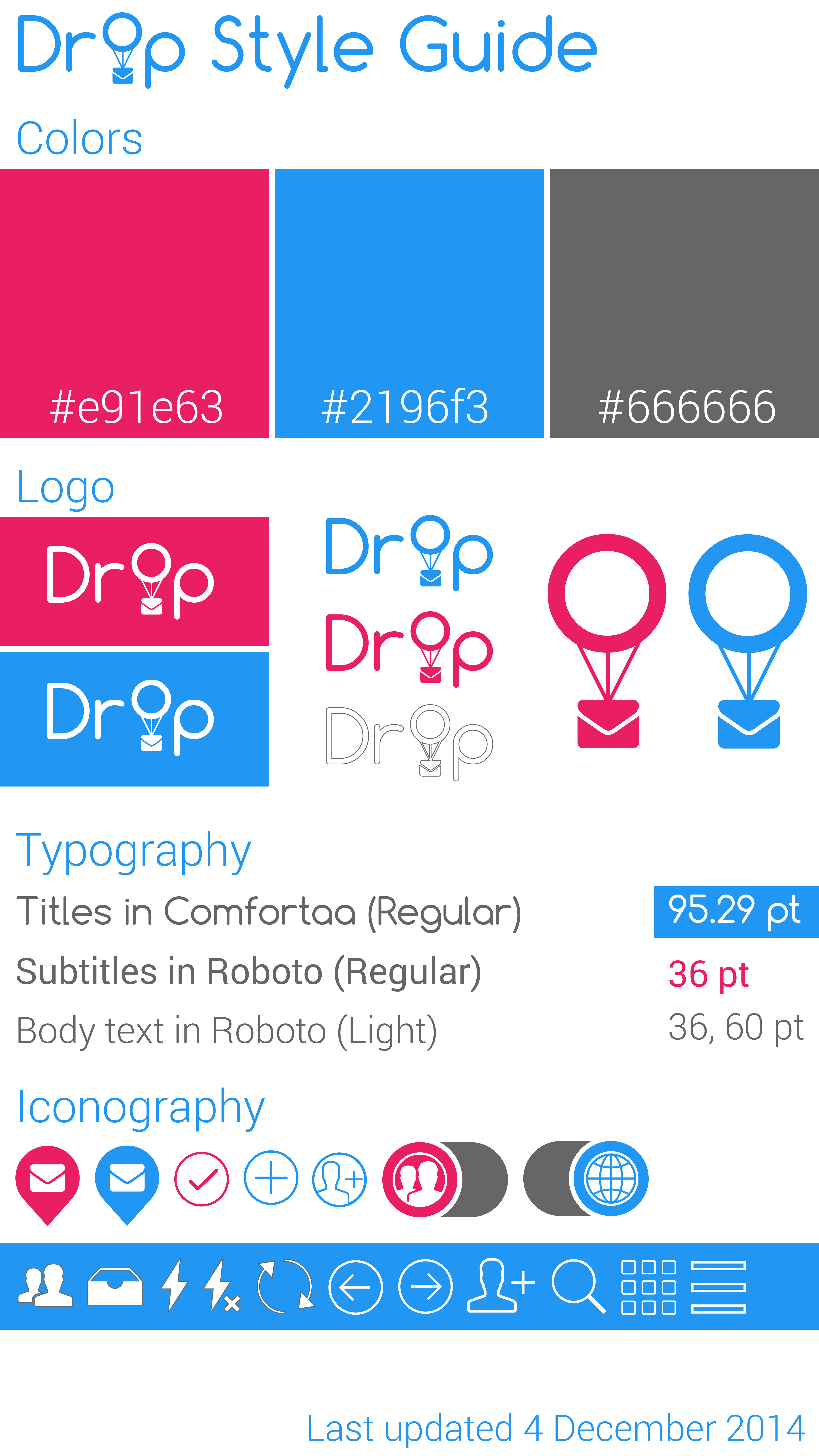
Style Guide
Video Demo
Drop has only 3 simple steps:
- Tap to snap.
- Swipe to the side to delete.
- Swipe down to drop it on the map at your current location.
Toq Watch Pairing
One of the main goals of the project was to pair our app with the Qualcomm Toq watch functionality in a nontrivial way. To do this, we made the watch essential to the collection of drops.
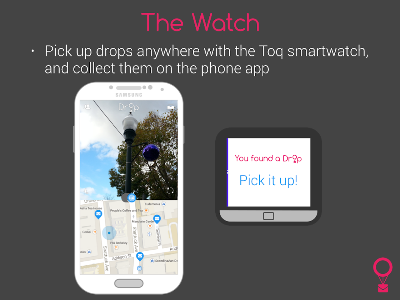
Travelers can easily pick up drops around them at any moment, deliberately or not, thanks to Toq notifications synced with the phone app.
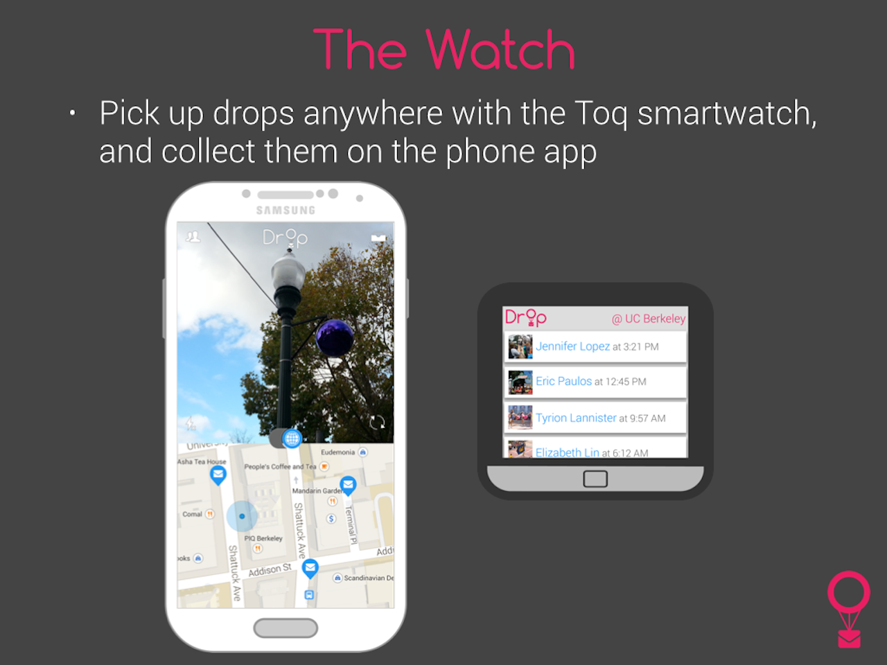
If there’s more than one drop in the vicinity, they can choose which to open from the list.
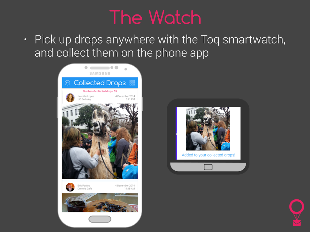
And once they have, that drop is collected to their phone, so people can share memories, save them, and make new ones too — all tied to a location. Local experts can make their mark, and urban travelers can feel like a part of the city already. Here’s a video of the Toq app in action.
Conclusion
Overall, we wanted to stay playful, keeping on-screen interactions whimsical within the technical constraints of the Toq watch as well as catering to as many versions of Android’s OS as possible. But the real interaction isn’t with the UI — it’s with the city, with strangers, with friends, with those special memories tied to that special place.