Design at Berkeley
Dates
January to April 2015
Built With
Mission
To follow the human-centered design process in order to create a student-curated, one-stop portal with all the information about design at Berkeley.
Technologies
Adobe Illustrator, Jekyll, SCSS
Research
First, we did competitive analyses, looking at websites with similar types of aims (e.g. Stanford’s d.school). What differentiated us is that all of these were sanctioned by the university/organization. We were creating a completely student-run website. We needed to go beyond one program to the entire world of design on campus.
Then, we knew we needed to talk to students about their actual experiences with (or without) design on campus. To find people to interview, we divided our “personas” into three categories — those who are active in design, those who are interested in design and looking to become more active, and those who don’t know about design.
From the research, we had some key insights and findings. A few of them are below:
- Students don’t know what types of tools they should learn/become proficient in for different types of design.
- Students aren’t sure what skills they need to become professional designers.
- There isn’t any specific access point into the design community.
- There isn’t any specific place to go to find information.
- Students are unsure what even encompasses design.
- Students find it hard to step into design if they don’t even know what classes are being offered.
- Those with no background have trouble even figuring out where to start.
- Classes take up a lot of time that could be spent on personal design projects.
The research was extremely eye-opening, and it proved to us just how necessary the website was for design at Berkeley. As our deadline approached, holding onto the knowledge of this impact helped push me forward.
If you’d like, feel free to jump ahead to the results of our design and development process and see how we encorporated our key findings.
Site Structure
We defined the information architecture of the website, figuring out the best way to lay out content on the homepage (complete with calls-to-action), and the best way to separate content within the rest of the site navigation. This did change over time, but it was very useful to start because it allowed us to figure out how to split the workload.
- Site structure
- Design at Berkeley (HOME)
- Resources
- Get Involved
- Events
- Contact
Original site structure — we also went more in depth for each bullet with the exact order of each page’s elements. This helped with both development of the design as well as the collection of content.
In the end, we split the two main focuses of the site — introductions to design and resources on campus — into the biggest sections. With future iterations, these will most likely be the sections we expand. For now, we made sure to list every club, competition team, and design space we could find so that other students could find them now as well.
Design and Development
While Shana and I both had a say in all parts of the website, she focused on the original design and I focused on figuring out what platform we would use. I wanted a CMS, because the site will be around long after we both graduate, and we wanted to encorporate a blog for Design Council members to write in as well.
I researched at least a dozen CMS platforms from Node.js to PHP to Python. Finally, after considering our hosting options, I decided on a flat-file system, and Shana and I went with Jekyll hosted on Github Pages. Jekyll has a lot of documentation across the web, and our setup made it extremely easy to split the development work as well.

Shana designed a color palette that was both fun and inviting, and we decided on a large hero image on each page to showcase actual images of the design community at Cal. Shana created graphics for the homepage and the intro to design page, and I coded up an early draft of the homepage she mocked up in Illustrator.
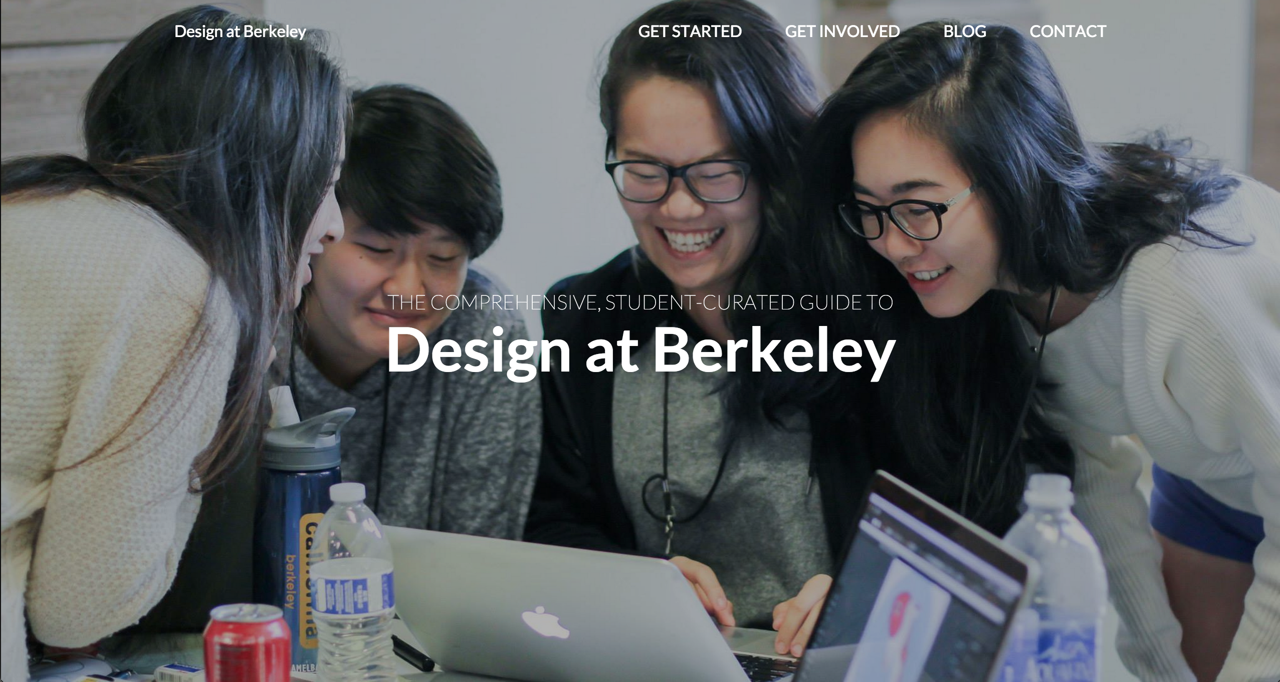 Hero image on homepage
Throughout this process, we got feedback from friends and people in Design Council. We went through many iterations of where the navigation bar should be placed and how it would transition when the page scrolled. I coded the classes page using jQuery so that we could make an AJAX call to our classes CSV file and link each class name in the file to its related page in the official UC Berkeley Course Catalog. In the future, it will be more efficient to keep the Current Classes page updated because webmasters will simply need to update the CSV file.
var url = "http://guide.berkeley.edu/search/?P=";
var str = "";
for (var i = 0; i < data.length; i++) {
  var course = data[i];
  var category = course.Category;
  var dept = course.Dept;
  var number = course["Number"];
  var title = course.Title;

  var div_id = "#"+category.replace(/ /g, "-");
  var current_div_html = $(div_id).html();

  str += current_div_html + "<li>";
  if (number === "98 / 198") {
    str += "<a href='http://www.decal.org/' target = '_blank'>" + dept + " " + number + "</a>"
  } else {
    str += "<a href='http://guide.berkeley.edu/search/?P=" + dept + " " + number + "' target = '_blank'>" + dept + " " + number + "</a>";
  }
  str += ": " + title;
  str +="</li>";
  $(div_id).html(str);
  str = "";
}
Translating CSV class data into links to the course catalog
We also attempted to include events posted on Facebook by different design organizations, but ran into some hurdles regarding developer keys. Ultimately, we chose to meet our deadline by featuring the blog on the homepage, and relegating the events section to a future iteration.
The blog was one place where we especially sought out content created by designers on campus. Everyone has such different experiences regarding design, from classes to clubs to simply how they discovered design, and it was important to us that we showcased that breadth on the site. It was pretty cool launching a brand new site with so much content already available for visitors.
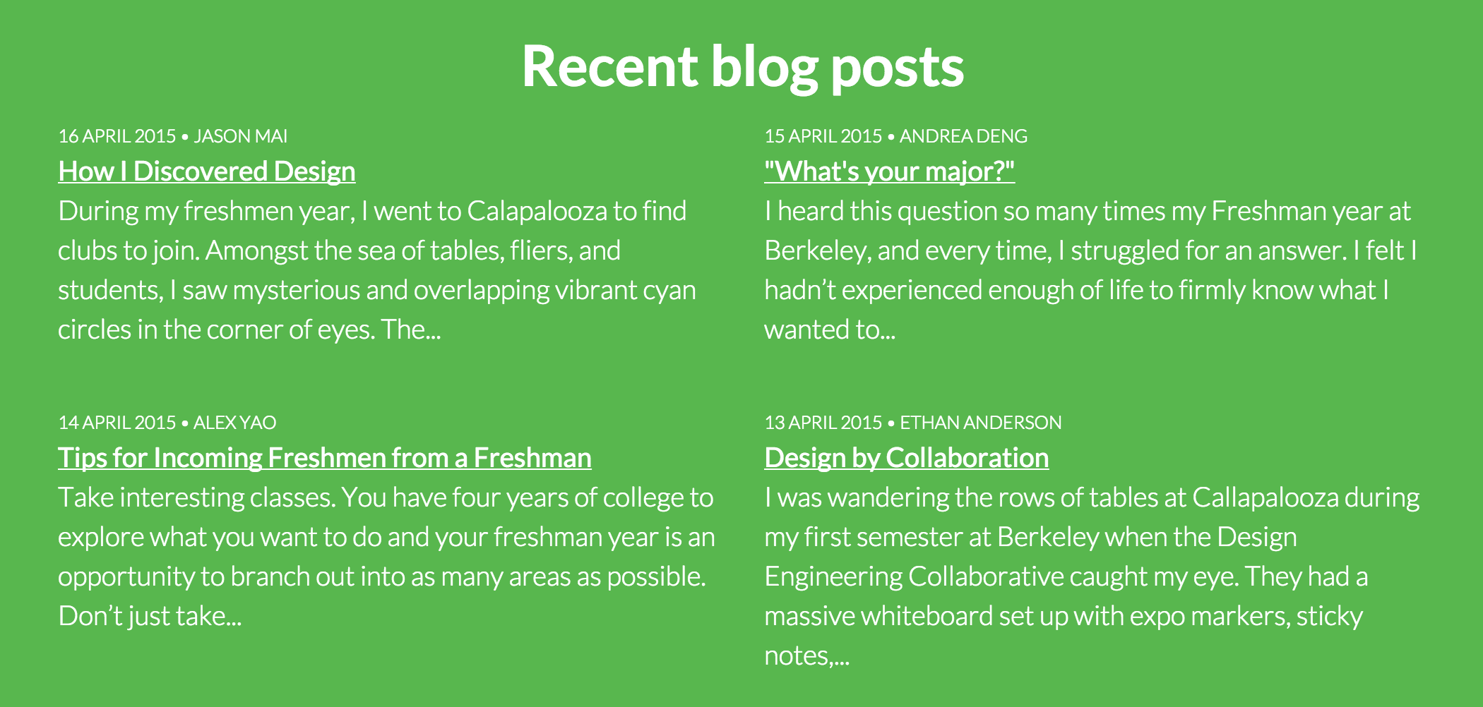 Recent posts section on homepage
Results
Research is insanely important, and led to all of our design decisions on the website. Below are our key findings + results, grouped accordingly.
- Students don’t know what types of tools they should learn/become proficient in for different types of design.
- Students aren’t sure what skills they need to become professional designers.
- Students are unsure what even encompasses design.
We created a page that both explains the types of design disciplines represented at UC Berkeley and includes relevant tools for said design disciplines. In the future, we hope to expand the website to include interviews with UC Berkeley alumni who went on to careers in design and what helped them achieve their goals.
- Those with no background have trouble even figuring out where to start.
Along with the intro to design page that features the disciplines, our collaborative blog features interdisciplinary designs from around campus. Students with no background can read the blog to learn from current students in design.
- Students find it hard to step into design if they don’t even know what classes are being offered.
We organized the classes page to feature currently offered classes grouped by the relevant design discipline for each class.
- There isn’t any specific access point into the design community.
- There isn’t any specific place to go to find information.
- Classes take up a lot of time that could be spent on personal design projects.
Our section on getting involved in design at UC Berkeley beyond taking classes is comprehensive, including the clubs, competition teams, and research opportunities on campus. Before the launch of the Design at Berkeley website, there was not just one place a student could go to get all this information, and students had trouble sifting through unrelated extracurriculars on UC Berkeley’s multitude of websites.
Summary
I learned a lot while making designatberkeley.com. I’d never used SCSS before in such a large capacity (I’ve only fiddled with it for this blog). I discovered how the Liquid templating system worked within Jekyll. I created my first responsive navigation that really works. It was great working with Shana, because I feel like I gained so much working with her design aesthetic and knowledge of SCSS and mixins. We made a really great team.
Working on this project energized me. Every time we discussed design and IA and dev tools, adrenaline raced through me. We only started coding at the tail end of the process, instead choosing to focus our early efforts on the human-centered research. This did lead to some hectic nights coding, but spending hours upon hours understanding frontend issues felt so good. It really shows that passion for a project is so important.
We met our deadline to launch the website by Cal Day, the campus-wide open house, and spread awareness of design on campus to as many newly admitted students as possible.